World Population Growth - should we be worried?
|
|
|
The data
Global population growth
Global population growth by regions
Population growth investigation
Part 1: Total Population
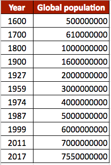
Click on the data below to open a spreadsheet with data for world population data.
- Use the data to draw a clear and accurate line graph showing Global Population Growth. You should make sure that both axes are labelled and that it has a clear title. Use a ruler and a pencil to draw the graph and make sure that it is neat and clear.
- Annotate your graph to show how long it has taken for each increase of a billion people. Calculate the time taken to get from 1-2 billion, 2-3 billion, 3-4 billion and so on.
- What do you notice about the speed of population growth
- What possible problems might this huge increase in the number of people cause for:
- The environment?
- Our ability to provide food for everyone? What about housing? Jobs?
Part 2: Growing and shrinking populations
Step 1
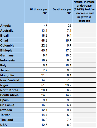
Click on the table below to open a spreadsheet with the data. Calculate the natural increase or decrease for each of the countries below.
To do this you should subtract the Death Rate from the Birth Rate (Natural Increase = Birth Rate - Death Rate). If the birth rate is higher than the death rate your answer will be a positive number and the population is increasing. If the death rate is higher than the birth rate your answer will be a negative number and the population is increasing.
Step 2
Use a colour code to show the countries and their rate of natural increase or decrease on a world map (this is called a choropleth map and there is a tool to help you create one below). Use the scale below:
- Natural decrease = blue
- Increase 0.01-9.9 = yellow
- Increase 10-19.9 =orange
- Increase 20+ = red
Step 3
Annotate your map to describe the patterns you can see:
Annotate your map to describe the patterns you can see:
- Which continent is the only one natural increase of more than 20? Which continent has natural decrease?
- What differences can you identify between LEDC/MEDCs?
- What might be the implications for future planning of resources around the world.