Population structure and population pyramids
The population structure of a country is how it is made up of people of different ages, and of males and females.
- The most common method to show the structure is by using a population pyramid. This graph is made up by putting two bar graphs (one for male, one for female) side by side.
- From this you can read off what percentage of a population is of a certain gender and age range.
|
|
|
Population pyramids for countries at different levels of development
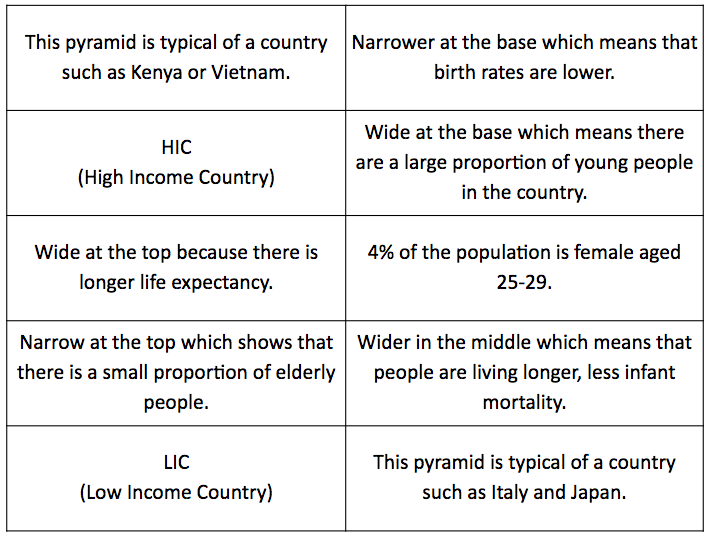
Use the base sheet and the annotations in the table below to create your own annotated pyramids for HIC and LICs.
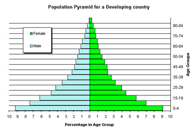
LICs/LEDCs/Developing Countries
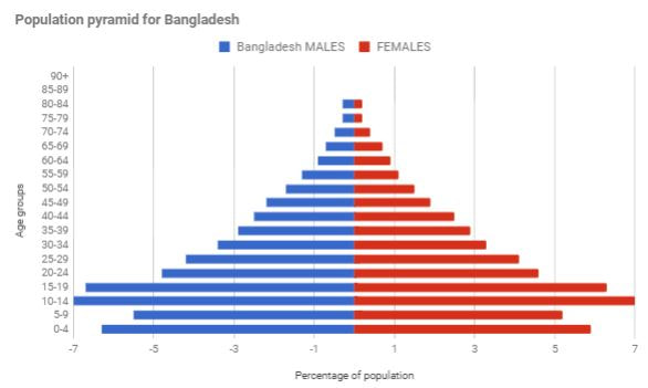
This population pyramid is wide at the base, which means there are a large proportion of young people in the country. It tapers very quickly as you go up into the older age groups, and is narrow at the top. This shows that a very small proportion of people are elderly.This shape of pyramid is typical of an LIC, such as Kenya or Vietnam.
This population pyramid is wide at the base, which means there are a large proportion of young people in the country. It tapers very quickly as you go up into the older age groups, and is narrow at the top. This shows that a very small proportion of people are elderly.This shape of pyramid is typical of an LIC, such as Kenya or Vietnam.
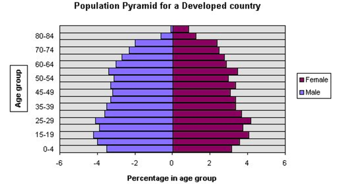
HICs/MEDCs/Developed Countries
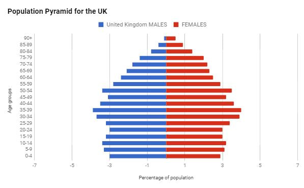
This shape is typical of a developed country. It is narrow at the base, wider in the middle, and stays quite wide until the very top, as there is a sizable percentage of older people. Note that there are more old women than men. Italy and Japan have population structures that are of this shape
This shape is typical of a developed country. It is narrow at the base, wider in the middle, and stays quite wide until the very top, as there is a sizable percentage of older people. Note that there are more old women than men. Italy and Japan have population structures that are of this shape
Population pyramids - research your own countries
Click on the image below to open a great website with population pyramids from all of the countries and regions of the world.
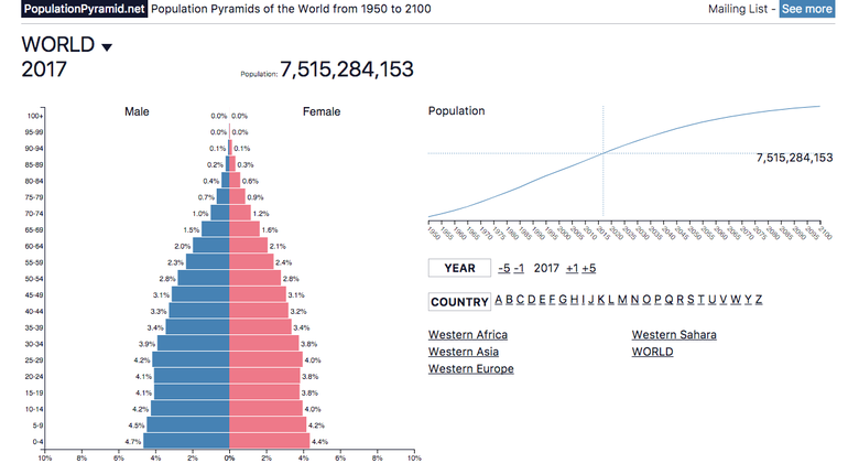
- Select at least three contrasting countries at different levels of development.
- Use screen shots and annotations to describe similarities and differences between the countries.
- Connect to development. Try to explain the differences.
- How are each of your countries predicted to change?
Create your own population pyramid using Google Sheets
You have used other people's population pyramids; now the challenge is to create some of your own using Google Sheets! This is fairly straightforward but you will have to follow the instructions below VERY CAREFULLY!! You might find the video below useful as well. Watch it first...
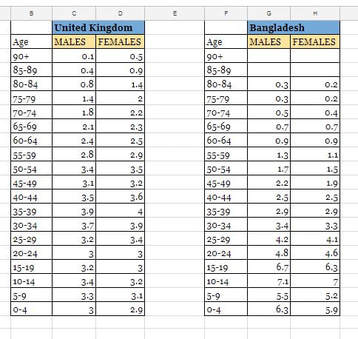
First you will need some data. You can find this below but there are also some websites you can use to obtain this information. The best one is probably the US Census Bureau website here.
The data you will use has already been found for you! Click on the image below to open it in Google Sheets.
The data you will use has already been found for you! Click on the image below to open it in Google Sheets.
Now use Google Sheets to draw your pyramids...
- Make sure that all of the ages are formatted as TEXT (to do this, highlight them and then select from the "Format" menu.
- Keep the female numbers as positive (plus) numbers; change the male numbers to negative (minus) numbers. This is just to make the graph work.
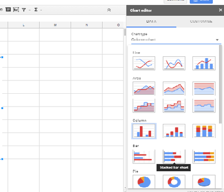
- Highlight the data including the column headings of Age, Males and Females.
- Choose "Insert Chart"
- From the Chart Menu change the chart type to a Stacked Bar Chart (see below).
Now you should have a basic population pyramid. The next steps are to make it perfect. Do all of the steps below.
Once you are done, copy your pyramids into a Google Doc and describe and explain what they show!
- Change the title of the pyramid. Your title should be "Population Pyramid for .........". Even better if you can add the year.
- Label the horizontal axis (Percentage of population).
- Label the vertical axis (Age group).
Once you are done, copy your pyramids into a Google Doc and describe and explain what they show!
|
|